A brandsite is a website that captures a brand’s essence. Its story, style, and personality. It’s not about selling, it’s about connecting.
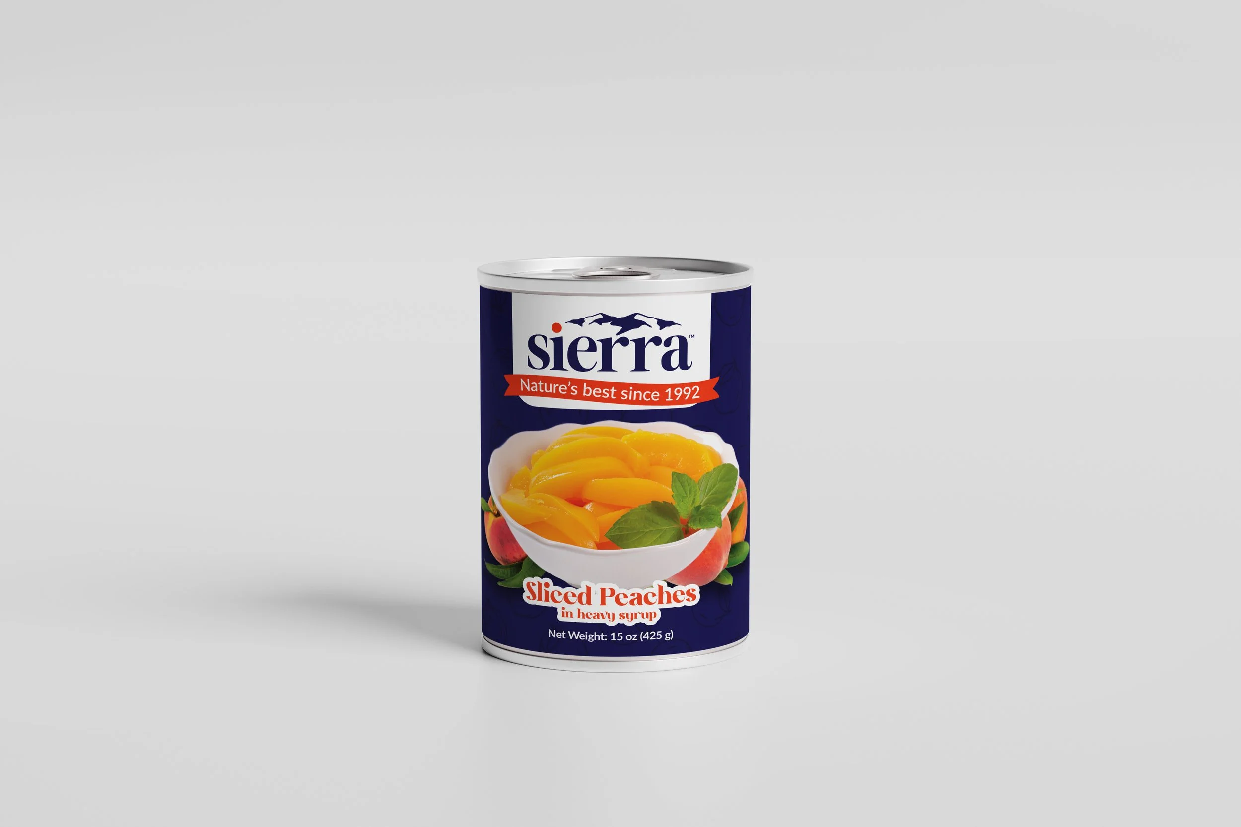
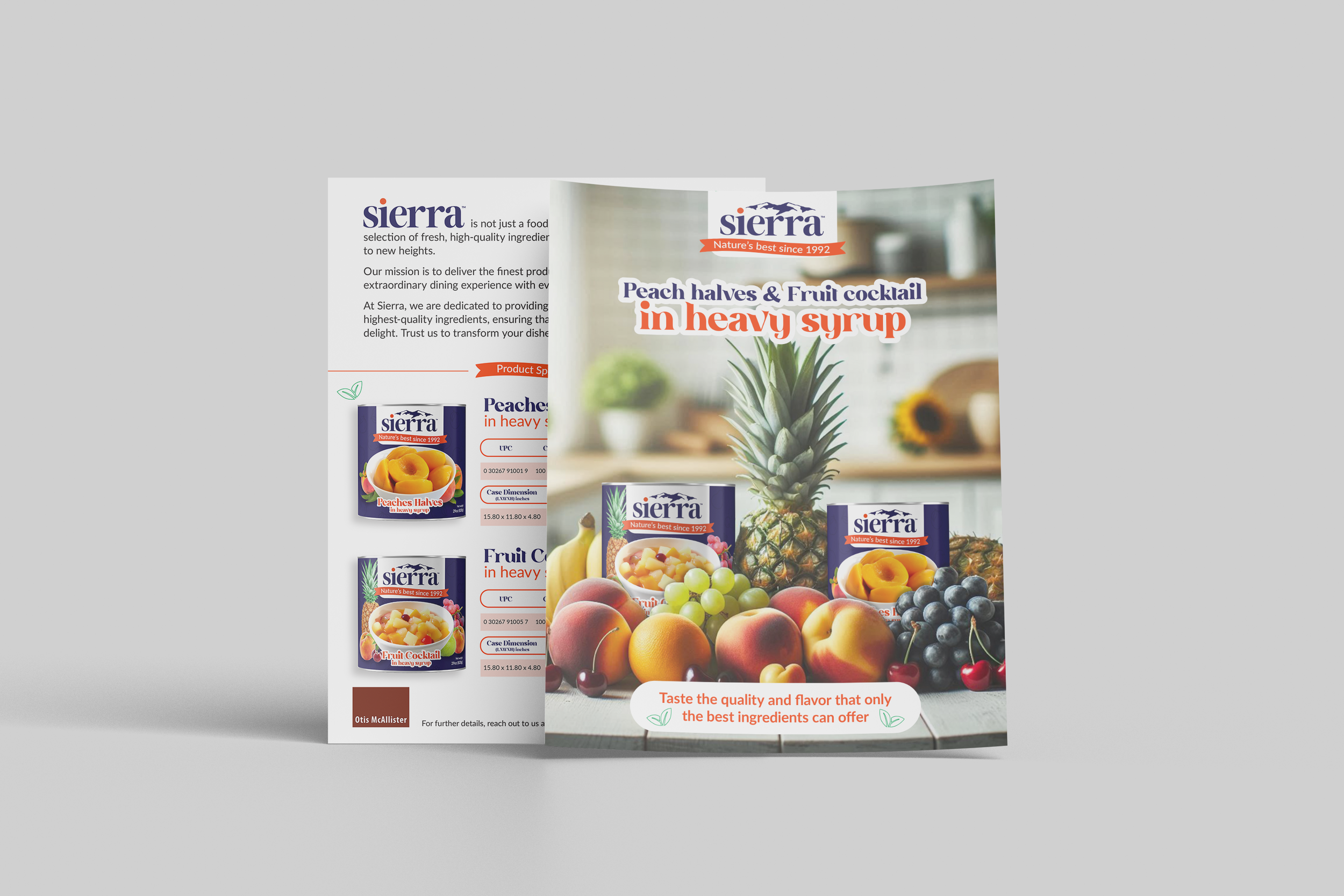
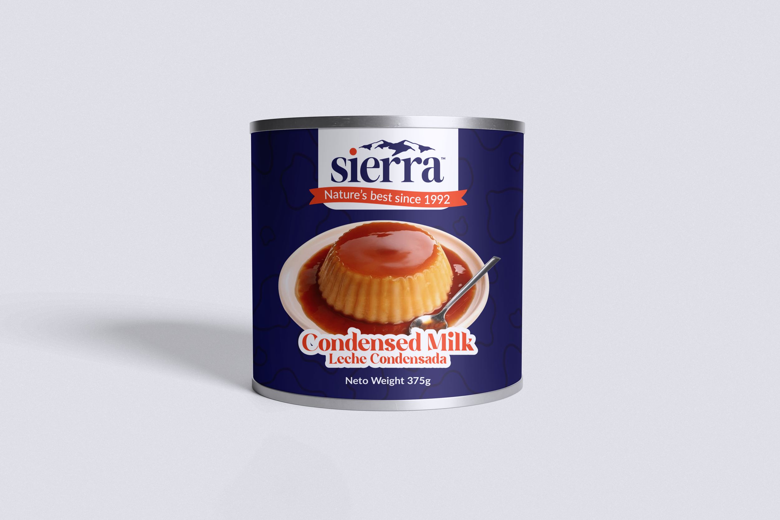
Sierra is more than a food brand, it represents a careful selection of fresh and high-quality ingredients that elevate your dishes to another level. Our mission is to provide you with the best products so you can enjoy an exceptional culinary experience in every meal.
With Sierra, you can trust in the freshness and quality of each of our ingredients.
The "Sierra" brand logo was designed to create a visual identity that conveys closeness, warmth, and friendliness. The illustration of the mountains next to the lowercase word "sierra" evokes a sense of nature and authenticity. The mountains symbolize stability and connection with the natural environment, while the use of lowercase letters adds a touch of familiarity and accessibility. Together, these elements create a welcoming and trustworthy image that resonates with the brand's values.
Fire Orange
RGB: 240, 73, 35
CMYK: 0, 87, 99, 0
Hex: #F04923
Pantone: 172 C
Blue
RGB: 42, 37, 89
CMYK: 100, 100, 32, 22
Hex: #28255F
Pantone: 5255 C
Deep Navy Blue
RGB: 38, 30, 70
CMYK: 92, 93, 41, 44
Hex: #261E46
Pantone: 273 C

Aplicaciones


